Know What’s Working and What Needs Improvement
Benefits You Can Expect:
- Increased Mobile Conversions
- Better SEO Performance
- Reduced Bounce Rate
- Streamlined Maintenance (one site, not many)
- Future-Proof Designs
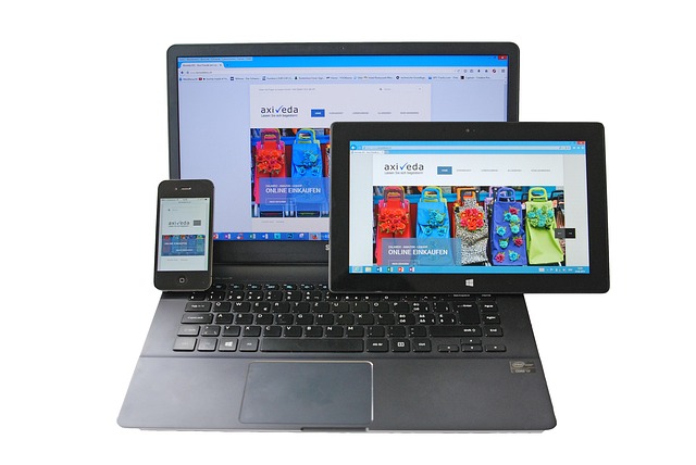
In today’s mobile-first world, your website must look and function perfectly—whether viewed on a phone, tablet, or desktop. At MarcoPolo Media, we specialize in responsive web design that automatically adapts to any screen size, ensuring a consistent and user-friendly experience across all devices.

Your site is built to perform flawlessly on mobile devices — where most users browse today.
Custom layouts and spacing for each screen type to maximize usability and readability.
Smart design systems that adapt content and visuals to different screen sizes.
Auto-scaling images and videos for fast loading without compromising quality.
Ensuring your site works seamlessly on Chrome, Safari, Firefox, and more.
Speed and responsiveness go hand-in-hand — we optimize for fast load times on all devices.
More than 60% of internet traffic now comes from mobile devices. If your site isn’t responsive, you’re losing customers. A responsive website provides seamless navigation, better engagement, and a strong first impression—no matter how users access it.
We design once and build for all. By planning layouts that scale fluidly, we ensure your website offers the same high-quality experience from phone to desktop.

A mobile-friendly site is a basic version that “fits” a small screen. A truly responsive design is much smarter—it reshapes your entire layout and content flow based on screen size. It’s about flexibility, readability, and performance. At MarcoPolo Media, we go beyond mobile-friendly. We make responsive design the foundation of every project.

At MarcoPolo Media, responsive design isn’t an afterthought — it’s part of every website we create. We understand how user behavior changes across devices and build digital experiences that feel natural everywhere.
Why Clients Rely on Us:
Mobile-First Design Principles
Precision Testing on All Screen Sizes
Focused on Usability & Speed
Google-Preferred Responsive Standards
Integrated with SEO, UI/UX, and Branding