We craft memorable visuals and brand identities that reflect your purpose and leave lasting impressions.
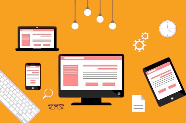
Flawless Design Across All
Devices
In today’s mobile-first world, your website must look and function perfectly—whether viewed on a phone, tablet, or desktop. At MarcoPolo Media, we specialize in responsive web design that automatically adapts to any screen size, ensuring a consistent and user-friendly experience across all devices.
Speed and responsiveness go hand-in-hand — we optimize for fast load times on all devices.
Why Choose MARCOPOLO MEDIA
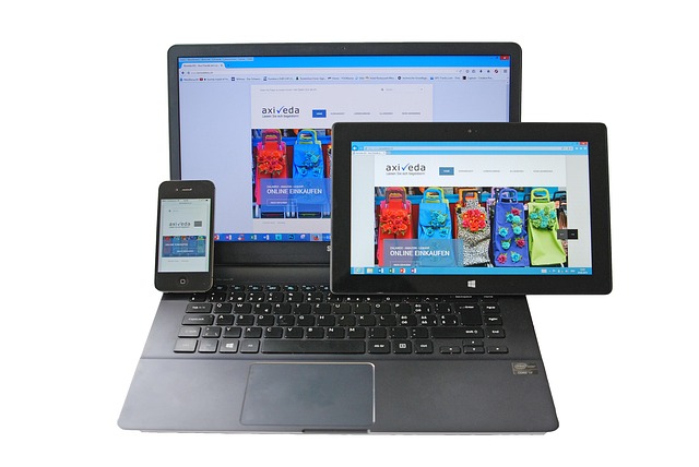
One Website, Unlimited Reach
Why It’s Crucial:
More than 60% of internet traffic now comes from mobile devices. If your site isn’t responsive, you’re losing customers. A responsive website provides seamless navigation, better engagement, and a strong first impression—no matter how users access it.
Our Approach:
We design once and build for all. By planning layouts that scale fluidly, we ensure your website offers the same high-quality experience from phone to desktop.
Know What’s Working and What Needs Improvement
Benefits You Can Expect:
Increased Mobile Conversions
Better SEO Performance
Reduced Bounce Rate
Streamlined Maintenance (one site, not many)
Future-Proof Designs
Marcopolo
Media
The Difference Between Mobile-Friendly and Responsive
A mobile-friendly site is a basic version that “fits” a small screen. A truly responsive design is much smarter—it reshapes your entire layout and content flow based on screen size. It’s about flexibility, readability, and performance. At MarcoPolo Media, we go beyond mobile-friendly. We make responsive design the foundation of every project.
Why Choose Us for Responsive Design?
At MarcoPolo Media, responsive design isn’t an afterthought — it’s part of every website we create. We understand how user behavior changes across devices and build digital experiences that feel natural everywhere.